
Question: Can any discernible pattern be identified in Houston’s lowest temperatures recorded each year?
Short answer: maybe? How is that for a quantifiable response?
Long answer: To try to answer this question, I have created a graph of Houston’s lowest minimum temperatures by year from the city’s official recording sites dating back to 1892. Again, the plotted data represents the single lowest temperature recorded at Houston’s official reporting stations at any time in each calendar year. As an example, the lowest temperature recorded in 2018 was +19°F set in January of this year. The lowest temperature recorded in 1989, as another example, was +7°F set in December of that year. Here is the graph by year:
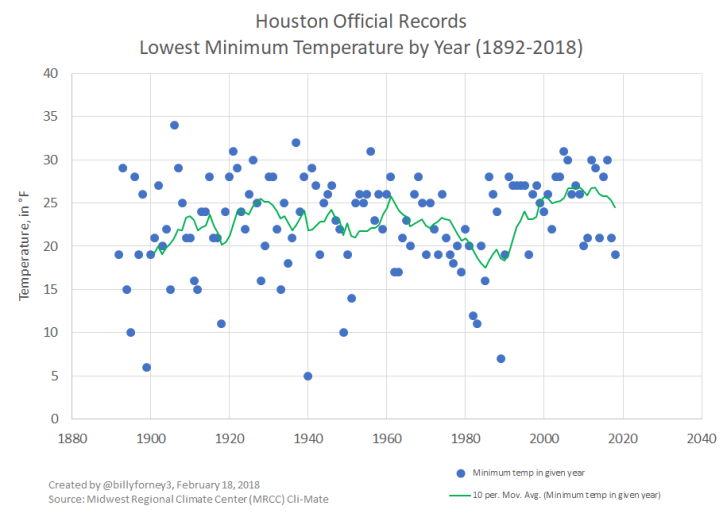
While there isn’t a real strong trend in this data, an interesting observation can be made about the dispersion of temperatures around the 10-period moving average (shown as the green line in the graph above). In the early 1900s, the dispersion appears quite large, but beginning in the 1990s, the dispersion around the moving average became significantly less. Why this is the case is not easily understood from the data, but let’s look at some possible explanations. For example, perhaps better recording devices and techniques were used in later years. Or, since the official reporting sites in the early 1900s were located at various locations in downtown Houston, it’s possible that small differences in the microclimates caused wider variations in temperatures. Taking this possibility further, if you look at the graph starting around 1970 (midway between 1960 and 1980 in the graph), the dispersion around the moving average seems to be much less variable after 1970 than before. This could be because the official reporting site was moved to its current location at Houston’s Intercontinental Airport. I mentioned this in a recent blogpost.
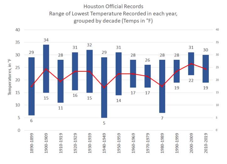
We could also look at this data grouped in decades. A graph of the range of values is below.

This graph shows the range of lowest temperatures recorded in a given year grouped by decade. In other words, during the ten year period between, say, 1940 and 1949, the lowest temperature recorded in any month during the year 1941 was 29°, which happened to be the warmest low temperature reading in the decade spanning 1940-1949. The lowest temperature recorded in any month during the year 1940 was 5°, which happened to be the coldest low temperature reading in the decade spanning 1940-1949. Thus, the range illustrated as the 1940-1949 decade spans from 5° to 29°. This process was repeated for each decade, and the results are shown in the graph. One could argue there is less dispersion in recent decades, with the 1980s being an outlier. One could argue our low temperatures in Houston have not been as “low” as in previous decades. But, there doesn’t appear to be much conclusive evidence from this data.
When we add a line graph representing the mean of the ranges for each decade, this is what we see:
I plan to look at the corresponding high temperature data, as well as the average temperature data, recorded each year for comparison purposes in future blogs.
Billy
